I’m pleased to announce that Meryath’s poster map is ready to go to the printer. This one’s story is as long as the Great Caldera’s (see my previous blog articles). The two were developed concurrently, as soon as we had a viable coastal outline. Some of Meryath’s geographical details carried over to the Great Caldera map, while some of latter’s graphic styling, especially the labels’ fonts and color scheme, found its way into Meryath’s poster map after Thorfinn and I settled final cosmetic details.
At a glance, Meryath’s poster map relates directly to Mystara’s Gazetteer maps, although hex symbols were altered to avoid copyright issues. Our favorite Master Cartographer designed new topographical symbols (hills, mountains, forests, etc) and selected their colors. I drew the tower, village, and various town symbols, besides generating basic map details.
The process then got very technical. I initially transferred the original coastline to Hexographer, the software by Inkwell Ideas which I have been using for the past three years to draw Alphatia’s regional maps on this blog. This was the simplest way for me to complete a preliminary draft, which you all saw on the Kickstarter page. This goes back to November 2013. The trouble was that I selected Hexographer’s “fractal” polygon setting to duplicate the original coastline. This introduced small discrepancies all along the shores. It looked good from a distance, but when closeups became needed, the discrepancies became an issue. Selecting straight lines or curves for the polygon settings didn’t look right either. Thankfully, our Master Cartographer converted my Hexo draft for use with his software. This fixed the coasts, making them perfectly identical to the Great Caldera source map.
As I mentioned in earlier blog entries, the original map labels were scrapped almost entirely in favor of Polynesian-sounding names. I couldn’t just “recopy” those from Ierendi, which is the general source of inspiration for Meryath. For best effect I hit the net for Tahitian dictionaries and such. After a hundred-plus labels, some actually came from Tahitian words, a few crept in which sounded more like Hawai’ian, Fidjian, Marquesan, alongside others I made up entirely. Many words were twisted around for the sake of generating labels, so those are probably gibberish, although I wouldn’t be surprised if they ended up actually meaning something hilarious in Tahitian or utterly offensive (my apologies for the latter, if ever I contributed such; for all I know, "Karakara" might in fact refer to some kind of horny swine.)
Toward the end I found a large document listing many Tahitian terms completely unavailable from dictionaries and online translators. This one was very convenient and revealing of Tahitian culture, detailing myriad canoe parts, charms and blessings for sailing, food preparation words, a host of different types of breadfruit, small animals, etc. Along the way, I found out that “Moorea,” the real-world Tahitian island, actually means “yellow lizard” (Mo’o + re’are’a—sounds a bit like Moria, doesn’t it?) That’s how I ended up with a Mo’o River. My favorite was the “Tiamimi” (a small poisonous crab), which became “Tiamimi Sands,” a long beach on Meryath’s southern coast.
Nonetheless, the challenge here is that the Tahitian alphabet contains far fewer letters than in western European languages (a, e, f, h, i, m, n, o, p, r, t, u, v). There are no “g,” “h,” “k,” or “w” in Tahitian, although there are plenty of them in Meryath’s fantasy Talikai dialect. Compare this with the Hawai’ian alphabet (a, b, d, e, h, i, k, l, m, n, o, p, r, t, u, v, w). Both languages use a ton of diphthongs and apostrophes, but for the sake of readability to us non-Polynesian ignoramuses (ignorami?), I had to stick with short words and vastly simplify others, often beyond recognition. Ignorance is bliss. We’ll have to assume “foreign” letters to be the result of Ellyrian and Narwani influences.
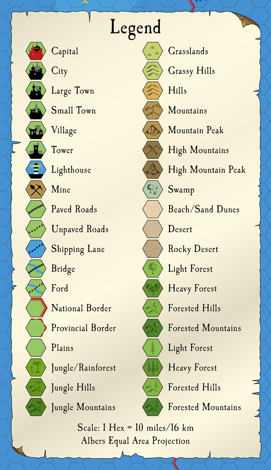
Our Master Cartographer reassembled this Humpty-Dumpty islander world, and added other fine bits such as the map key, the scale bar, and the banner. The key is expanded from the standard Mystara design. There are now different mountain heights and single peaks, for example. The entire key isn’t shown on the map, however, as all terrain types presently available could not fit (nor did they need to be displayed).
Remaining true to my old habits, I suggested adding Meryath’s coat of arms. Using another app from Inkwell Ideas, not so-surprisingly called Coat of Arms, I generated a basic design. In short it refers to the sea, at the bottom, since the Talikai are descendents of the Manaani “Sea People” who colonized this part of the Great Caldera. The top section is gold with a red dragon. This refers to the history at the kingdom’s core, which you will discover in the book.
Looking at the project’s storyboard, an extra half-page map was needed to display the region around Glorathon. I originally used a section of the hex map, and added the extra labels for roads, rivers, and other local details. Thorfinn then suggested a different approach. He cropped a section of the Great Caldera map, and laid in a hex grid and Gazetteer-like symbols over it. So here we have it, a hybrid natural/topographic map using a hex grid and stylized symbols. I liked that one better and decided to go along with the idea. I’m sure you’ll agree it has a character of its own. The image posted below is an earlier version (a few tweaks are in the works as I type these words).
So far, we have five geographic map styles. First is a stylized world map showing continents, climatic zones, as well as wind and sea currents. The Great Caldera’s natural/topographical style is more appropriate for single continents or large regions. The Gazetteer hex map style is intended for specific kingdoms—one of the reasons behind this decision (besides a desire to stay true to the old Mystara Gazetteer/BECMI Isle of Dread map) is that it supports accurate accounting of the realms’ economics (actual square-mileage, population, wealth, armies, etc). Sounds familiar, doesn’t it? The next map style is the hybrid natural/topographic rendition with hex grid and stylized symbols, for use with small regions. Finally, we have Glorathon’s city map (drawn by yours truly), which shows the street layout and the position of building blocks. There are also maps for the skyships, but these aren’t geographic—more like detailed diagrams more akin to dungeon mapping. Perhaps another blog entry previewing these is in order very soon.
All that being said, there’s still work to be done to complete the project. The cloth map is ready to go. I already received a “test print” and was very surprised by its quality. The fabric is tightly woven, soft, and very pleasant to the touch. The printing came out amazingly sharp—much more so than I anticipated. The Calidar bookmarks have already been ordered, and I’m waiting for delivery. The last few maps are being finalized for the book. The internal art, as I mentioned earlier fell behind schedule. The problem got bad enough that I reassigned the remainder of the b/w illustrations to another studio. This is the main source of the delay, which is likely to push the final release past mid-July.
I’m now reaching a point where I can start thinking about the second book. Ideas are already accumulating in the back of my head. Then again, a trip to France is in the works, and V-Con is coming up in October. I plan to run two game sessions there, in addition to seminars. Both games will focus on skyships (big surprise!), though one will be written for Mystara and the other for Calidar, both using BECMI mechanics. I’m hoping to publish the Mystara adventure on this blog, like I did last year after I got back from Lucca Games. The other will either go the same route or find a way into a magazine’s pages. After this, the road is clear and I can start working on Episode Two and its kickstarter.
Another mountain to climb!


No comments:
Post a Comment
Note: Only a member of this blog may post a comment.