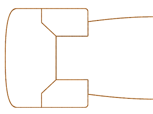
What a difference several years make. When I embarked on the mission to publish my own books eight years ago my skill level was minimal. Most of what I learned during my 15 years at pre-WotC TSR in the 80s and 90s was still there, but much of it no longer matched the self-publishing realities of the 2010s or the kind of work required when operating independently from an established publisher with somewhere near 100 employees. In the distant wake of the Voyage of the Princess Ark that I authored in the 90s for Dragon Magazine, I wanted a series of skyship deck plans to be featured at the World of Calidar's core. At the time, I had no idea what to expect from a Kickstarter, and the price tag of having these maps drafted by professionals seemed well over what I might be able to afford. So, I drafted the maps the best way I could back then. Here's a "before" & "after" snapshot showing what the original maps looked like vs. what I'm doing now.
 |
| Before: a simple diagram published in CAL1 "In Stranger Skies" in 2013 |
 |
| After: a work-in-progress rendition of the revised main deck & superstructures |
I use a freeware application called PaintNet. Though limited in its graphic abilities, its learning curve is fairly low. It does require a lot of add-ons, and I rely heavily on 3rd party textures and stock art for details. Those took years to accumulate. The result speaks for itself. Here are a few more sneak previews of the final work.
 |
| Main Deck, Stern Section |
 |
| Outlines Layer by Itself |
Work files are raster graphics, which presents a challenge when adding colors or textures within line art. To prevent badly pixilated edges resulting from a simple attempt to fill in colors, layered graphics become a must. The complexity of fully detailed renditions often requires 15-20 layers (such as outline layers above color or texture layers, or whatever lies on a table layered above table graphics, which lies above chair elements, carpet graphics come next, and that lies above floor textures, and so on). Add to this any number of temporary layers that get merged with permanent ones during the drafting process. Patience with this is key.
 |
| Filled-In Textures Layer |
Good luck making corrections later if something doesn't look quite right. Every single layer will need to be looked at. A common mistake is adding something to the wrong layer, and then spending precious time later to find which layer it was put on. This is when the cats perk up at the sound of muttered French swearing as I switch layers off and back on, hoping I didn't mess up something else.
 |
How about some shadows? |
The texture for the floor or in this case a ship's wooden deck begs for some thinking as regards how it might blend in with a grid. Some trial and error is to be expected here until the graphics are scaled properly.
 |
| Grid vs. Texture Layers |
You're getting the idea. Add to this the layers for what should show "above" the walls' texture, such as doors and windows. Way up higher, you'll position layers for map symbols (stairs directions, secret doors, etc.) and labels.
 |
| Upping the Ante: the Lower Deck with full details |
Here's another view with everything and the kitchen sink. Oh, the joy of making sure stairs connect exactly with those on adjacent decks. I'm a stickler for this, although most players and DMs won't lose sleep over a few pixels. While in game, this won't matter. I made precisely this kind of error in my original diagram of 2013, much to my dismay. It's now fixed in the revised version. Ugh. How embarrassing.
Just for fun, I'm including a screenshot of the hold's forward section. The final work includes two 12"x18" sheets and the digital files rendered at 600 dpi (with and without labels). I'll see if I can include VTT files for use with Roll20 and such; that's new territory for me. Drafting the revised deck plans took exactly 2 weeks, working pretty much full time, using the old map version and the original sketch produced by the cover artist, Ben Wootten. The design was part of the last
Kickstarter project I ran, July 2021. Backers receive this as part of their rewards. The deck plans will become available to the public on
DriveThru probably before the end of this year. Ideally, I'd like to redo all of the deck plans in CAL1, but this will have to wait until I'm done with the current project. If you have questions, contact me via
Facebook or
Twitter. Hope you enjoy your weekend!
 |
| Happy Flying! |


No comments:
Post a Comment
Note: Only a member of this blog may post a comment.